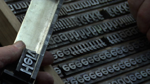
helvetica*
*shown here in Verdana – blasphemy!
The other night we watched Helvetica, a documentary about that particular typeface, typography and graphic design, and their role in our culture. Graphic design was my major in college so I had fun watching famous designers talk about their intense typographic passions.
Like one of the designers in the movie, I was of the last generation to study graphic design pre-computers. Or at least that’s how I started; I witnessed the transition. Initially we had a full-time photo typesetter in the Visual Communications department. When we wanted to mock up a layout we would look at type books and either draw the letters by hand or else specify what we wanted her to generate for us. She printed the text on glossy photo paper and we used surgical scalpels to cut out the words and paste them in place. It was laborious.
When I started my degree there were two Apple Classics jammed in a corner of the animation studio. I used one once, during an afternoon computer introduction class. By the time I graduated half the print shop had been taken over by Macs running Quark, alongside a giant laser printer.
In my final year I was able to create a curve of text on-screen instead of by snipping the paper between each letter and then curving the tiny strip to shape, simultaneously trying not to get spray adhesive everywhere and my sleeve stuck to the page. A door opened too suddenly no longer meant half-an-hour on the floor, rounding up vital paper scraps.
Now obviously I love computers (or this blog wouldn’t be here) and designing layouts with current technology is dreamy in its ease. But watching the documentary took me back to the time I spent immersed in letterforms, and the physicality of building a layout with paper. Those techniques, while maddeningly slow, were in direct relationship with the materials, and that is how I work best. I like to build – with beads, with stitches, even with tiny strips of paper.

May 2nd, 2008 at 3:54 am
I LOVED watching that film!
…and everything that cut and paste used to mean!
May 2nd, 2008 at 10:51 am
I remember my mother literally cutting up her novels and reorganizing them by laying the cut out pieces on the floor of her study. It was such a physical aspect of her writing. How things have changed.
May 3rd, 2008 at 7:19 am
Incredible, the speed of time. You could star in a diorama of life in the olden days! “There’s someone churning butter.” “There’s someone setting type.”
When I graduated from high school I got a really nice electric typewriter. It was cutting edge back then, but it beeped every time I made a spelling error, and I was writing a lot of papers in Spanish…..
Now I feel like we’re living with that machine from Star Trek, where you ask for what you want to eat or drink or wear and the computer gives it to you. Just this week I said to my computer “metal lunchbox”, “custom bobblehead”, and “linen shirts” and they all got to my house in 3 days.
May 3rd, 2008 at 7:25 am
I recently watched ‘Stephen Fry and the Gutenberg Press’ on BBC iPlayer, but it doesn’t seem to be available anymore. If you get the chance to watch it you might like it too. 50 mins long.
Stephen Fry traces the story of Gutenburg, whilst a replica press is made, and mr Fry even cases a letter ‘E’ himself.
Will watch out for Helvetica.
May 6th, 2008 at 8:12 pm
Hear hear! I feel like I could have written that post myself. I had a very similar experience at the start of my career. We must have come up through college around the same time. I love computer and desktop publishing, and all of the freedom that comes with it. But every once in a while I feel like picking up the traditional tools. Long live the Rapidograph!