May 1st, 2008
*shown here in Verdana – blasphemy!
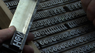
The other night we watched Helvetica, a documentary about that particular typeface, typography and graphic design, and their role in our culture. Graphic design was my major in college so I had fun watching famous designers talk about their intense typographic passions.

Like one of the designers in the movie, I was of the last generation to study graphic design pre-computers. Or at least that’s how I started; I witnessed the transition. Initially we had a full-time photo typesetter in the Visual Communications department. When we wanted to mock up a layout we would look at type books and either draw the letters by hand or else specify what we wanted her to generate for us. She printed the text on glossy photo paper and we used surgical scalpels to cut out the words and paste them in place. It was laborious.
When I started my degree there were two Apple Classics jammed in a corner of the animation studio. I used one once, during an afternoon computer introduction class. By the time I graduated half the print shop had been taken over by Macs running Quark, alongside a giant laser printer.
In my final year I was able to create a curve of text on-screen instead of by snipping the paper between each letter and then curving the tiny strip to shape, simultaneously trying not to get spray adhesive everywhere and my sleeve stuck to the page. A door opened too suddenly no longer meant half-an-hour on the floor, rounding up vital paper scraps.
Now obviously I love computers (or this blog wouldn’t be here) and designing layouts with current technology is dreamy in its ease. But watching the documentary took me back to the time I spent immersed in letterforms, and the physicality of building a layout with paper. Those techniques, while maddeningly slow, were in direct relationship with the materials, and that is how I work best. I like to build – with beads, with stitches, even with tiny strips of paper.
Posted in books, films & music | 5 Comments »
April 23rd, 2008
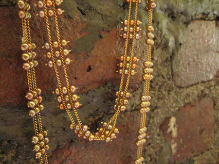
I just sent out a special order Long Squares Necklace. This one in goldish-pink pearls.

It still seems miraculous that women I’ve never met are wearing my jewelry. I love it! It feels thrilling and mysterious.
Posted in jewelry | 5 Comments »
April 19th, 2008
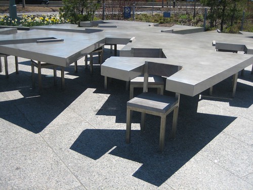
After going to MJSA I walked through Hudson River Park and came across these sculptures.


They’re so playful and practical at the same time. Turns out the piece is called Two Too Large Tables and is by Allan and Ellen Wexler. On their website there are many more inspiring projects.
Posted in sculpture | 3 Comments »
April 17th, 2008
I went to the Manufacturing Jewelers & Suppliers of America show on Tuesday. It was my first time; I’m trying to network more and make use of the tremendous resources that are out there for jewelers.
I went with another jeweler who works completely differently than I do. We were attracted to different booths – I stopped at bead sellers and clasp manufacturers, she talked to CAD specialists and an enameler. It was fascinating, if I’d been on my own I would have missed a lot.

I bought some small vermeil beads. I’m not sure what I’m going to make with them but they’re the perfect size for something like a Wild Geese necklace.
I’ll probably just pet them and love them for a while first though.
Posted in jewelry | 3 Comments »
April 14th, 2008
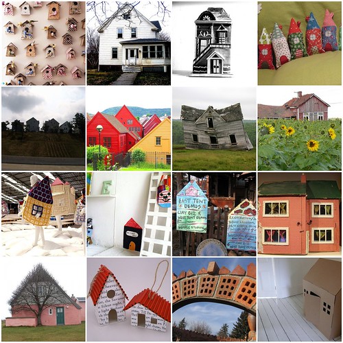
Please forgive me for neglecting the blog; I have houses on the brain.

One in particular.
Posted in today | 9 Comments »
April 9th, 2008
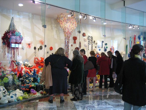
On Sunday I went to the Winter Garden for the opening of the Hyperbolic Crochet Coral Reef. The project marries craft and mathematics, and brings attention to the ocean’s endangered coral reefs.
The pieces are every shape imaginable, and made from everything from wool to trash.

I got to meet Helle, who has flown in from Australia. Her Rubbish Vortex is hanging in the middle of this snapshot…

It’s made entirely from plastic bags of every color, sent to her from all over the world. I find the piece particularly moving; the real trash vortex in the pacific is large enough to be compared to a land mass and makes this planet seem very small and vulnerable.
Posted in knitting & crochet, web | 7 Comments »
April 5th, 2008
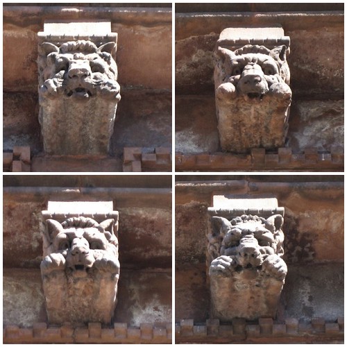
I was in Park Slope last week and took some pictures of the Montauk Club. It’s a fabulous, ornate building.

What struck me this time was how the faces of the gargoyles initially appear identical but they’re actually very different. Each has his expression: grumpy, scared, bored, peckish…

They make me think of the lion in the Wizard of Oz. I want them to talk to me.
Posted in city, today | 2 Comments »
March 29th, 2008
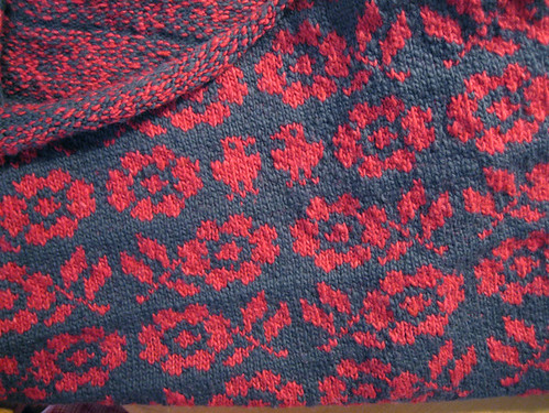
There are daffodils blooming at the end of our street and birds keep showing up in my knitting. These guys in the center back of my cardigan…

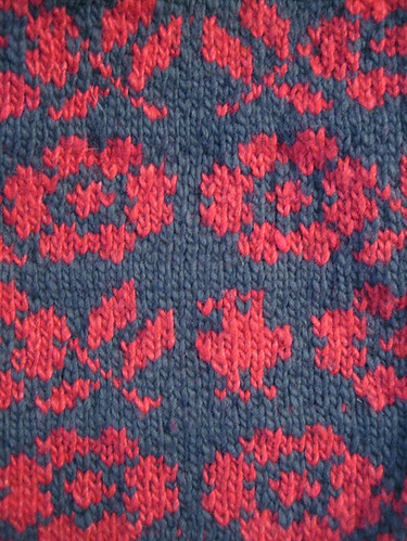
…and this one on the lower left front.

They make me think of a song by The Be Good Tanyas with the lyric the littlest birds have the prettiest songs. They make me happy. It’s spring.
Posted in knitting & crochet | 5 Comments »
March 23rd, 2008
M is out of town and some people are either missing him a whole bunch or else taking advantage.


Posted in today | 5 Comments »
March 20th, 2008
I went upstate again today for some further house-buying investigation. This time I took the bus.

Photo courtesy of brilarian on flickr.
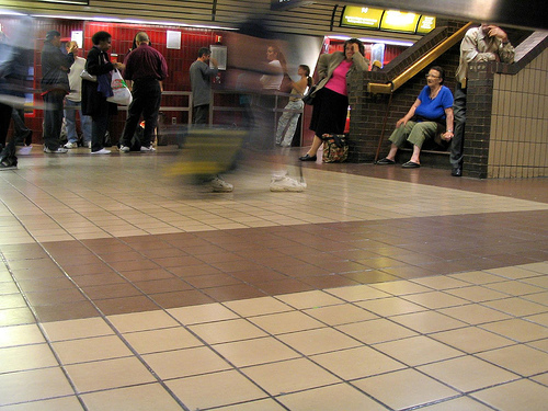
Leaving New York by bus mostly involves going through the Port Authority terminal which is vile – an urban level of Dante’s inferno designed specifically for human discomfort.
I was standing in line waiting to board and a soft-spoken young man wearing a white cap and carrying a backpack approached me. “Free poems,” he said, holding out a sheet of paper from the stack of photocopies he was carrying. Out of habit I shook my head and he moved on to the next person, who also shook their head. Everybody turned him away.
I wish now that I had said yes. He was so gentle and he wasn’t selling anything; he was giving away his poem. I wish I had accepted it.
Posted in city, today | 8 Comments »
