designing diamonds
Wednesday, May 28th, 2008
A snapshot of the necklace I’ve been working on.
This might be the first time I’ve made a new design in something other than white pearls! Still pearls though. Can’t get too way out.
A snapshot of the necklace I’ve been working on.
This might be the first time I’ve made a new design in something other than white pearls! Still pearls though. Can’t get too way out.
I am in love with this bed by Shawn Lovell, who just won a 2008 Niche award.
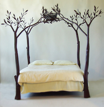
How could you fail to sleep well?
I also covet her gorgeous trellis.
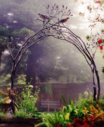
Of course the whole established perennial garden is part of the dream too. Better find me a plot and get digging.
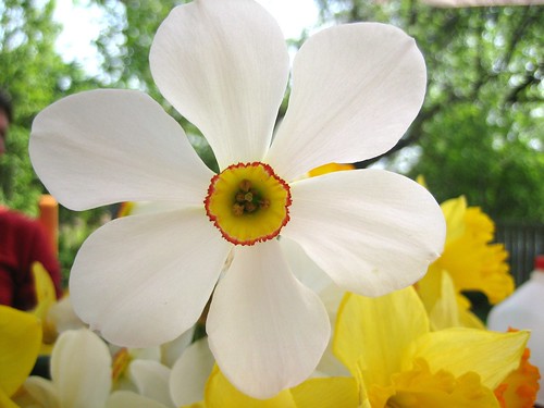
I’m home after a relaxed break with family in Quebec.

There was excellent weather, lush green, beautiful flowers, good company, abundance of food, pretty walks, and funny-looking creatures.


Good times.
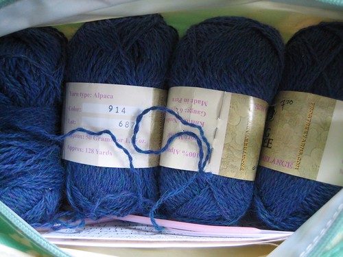
I’m heading out to spend a few days with family in Canada. I was packing yarn for a light-weight travel knitting project and first I thought, “Two balls will be plenty.” But then I remembered that terrible time when I was stranded in an airport hotel in Amsterdam for 24 hours, and I packed all four just in case. You never know, and you can never have too much comfort yarn.
Back next week!

It’s warm enough to open the windows. There is so much to hear. An ice cream truck has taken up residence at the end of our block and throughout the day the constant jingle comes in and out of my consciousness. Guys working on a car, dropping tools on the sidewalk. A couple fighting. Sirens. A helicopter. A girl yelling, “Come jump with us!”
*shown here in Verdana – blasphemy!
The other night we watched Helvetica, a documentary about that particular typeface, typography and graphic design, and their role in our culture. Graphic design was my major in college so I had fun watching famous designers talk about their intense typographic passions.
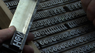
Like one of the designers in the movie, I was of the last generation to study graphic design pre-computers. Or at least that’s how I started; I witnessed the transition. Initially we had a full-time photo typesetter in the Visual Communications department. When we wanted to mock up a layout we would look at type books and either draw the letters by hand or else specify what we wanted her to generate for us. She printed the text on glossy photo paper and we used surgical scalpels to cut out the words and paste them in place. It was laborious.
When I started my degree there were two Apple Classics jammed in a corner of the animation studio. I used one once, during an afternoon computer introduction class. By the time I graduated half the print shop had been taken over by Macs running Quark, alongside a giant laser printer.
In my final year I was able to create a curve of text on-screen instead of by snipping the paper between each letter and then curving the tiny strip to shape, simultaneously trying not to get spray adhesive everywhere and my sleeve stuck to the page. A door opened too suddenly no longer meant half-an-hour on the floor, rounding up vital paper scraps.
Now obviously I love computers (or this blog wouldn’t be here) and designing layouts with current technology is dreamy in its ease. But watching the documentary took me back to the time I spent immersed in letterforms, and the physicality of building a layout with paper. Those techniques, while maddeningly slow, were in direct relationship with the materials, and that is how I work best. I like to build – with beads, with stitches, even with tiny strips of paper.